8 Professional Tips for Web Page Design
July 1, 2024

A web page’s design can either draw in a visitor or turn them off completely. In this article, we cornered Kylee Priest, our designer extraordinaire to tap into her genius. She’s sharing eight professional tips to enhance any web page design. Whether you’re a seasoned professional or a novice toying with some ideas, the advice is the same: Create a cohesive and simplified experience! Use these tips as guidelines to focus your ideas, streamline your layout, improve usability, and harmonize every element:
"Learn Everything You Can About Your Client
- Do they already have a brand established?
- Do they have a logo or color scheme?
- Do I need to add/tweak colors?
- What is the base?
- What do they do?
- Who is the target audience?
- What message do they want to communicate?
- What do they want the viewers to do?
- HOW do they want to present themselves?
My main objective is to communicate their objective and get their target audience to do what they want them to do.
If I don’t have much experience with that industry, I’ll do some additional research and look at other competitors’ websites and analyze the different approaches. I try to generate ideas as to what will communicate the message in the best way.
Understand the Power of Contrast
Make a website user-friendly and accessible by using contrast in your design. If there’s overlays–text over images–it can be harder to read. I make sure that everything is readable. I check it using an AA accessible colors website to make sure the contrast ratio is high enough. The contrast ratio needs to be at least 4.5 between the background color and the text.
Use the Tools that Work for YOU
Even though Adobe XD is on the way out, I do most of my designing there. It’s what I’m comfortable with. Soon, JamboJon is moving to use Figma instead of Adobe XD, so that’s an exciting change.
For logos, I love to use Adobe Illustrator. Photoshop is always a must when removing backgrounds from images to get isolated images from a site. I use accessible-colors.com to check contrast ratios. When I need an image, I use Adobe Stock or ChatGPT to generate images. If I need to create a color scheme, I like to use the color palette generator on Adobe.
I grew up in the Pinterest age, so I sometimes use Pinterest, even in my downtime, to brainstorm and see other designs out there. I have a Pinterest board for inspiration for website design.
Get Inspired by What Surrounds You
Everywhere I go, I’m looking at the designs. Driving down the highway, I’m studying the billboards and picking out what I like and don’t like. I’m especially big on typography–it makes or breaks a design. Typography is more than just the fonts. It’s also the alignment and the spacing. For simplicity, you don’t want to exceed two fonts on any design.
I see design ideas on Pinterest and social media. As I use other people’s websites, I notice the design elements or when they’re trying too hard. Just stay current by being observant of the designs around you - what works and what doesn’t.
Be Strong and Consistent
Create a hierarchy in the content. This means that the main headers look like main headers, sub headers are smaller than that. It makes the website more user friendly and organized. I use strong headers (both in looks and language) using short and concise wording to help it be more eye-catching. I finish with a strong call to action. You know what the website’s asking and what you want to do. It’s not confusing.
Consistency should really speak the brand’s message through the colors and elements. Regardless of your design elements, if they have a purpose, fit with the branding, follow the hierarchy, and do not overcrowd the page or shout in your face, then they will be effective.
Not Every Space Has to Be Filled
I play around a lot with the designs and add in elements that fit the brand. Then, I’ll go back in and look at the design and take out one thing at a time. If it’s white space, then that panel is a focal point. I remove things that are catching the eye that shouldn’t be. If it’s something that feels out of place, it needs to go. Sometimes I can reduce the size of an element, or increase the size of something else, or swap it to a different panel.
Design All Website Pages Side by Side
For consistency, I design with the same branding colors throughout the entire site. I use the same elements on each page, whether it’s an icon or a branding graphic. I keep the same buttons, borders, shapes, fonts, types of images, photos, or illustrations. I can’t necessarily control the content on each page, but the way the text is displayed stays the same.
You Don’t Want to Overdo It
After playing with the design, I always like to go back and simplify it. Simplifying is important. You want the site to serve its purpose. I watch out for “fluff” because it can make things too chaotic and crazy. I’m also a big fan of white space. I use it to keep everything clean and nice. It’s a design element in and of itself. If it’s simplified, it will have better functionality and not be overwhelming to the user.
Mastering the art of web design requires strategy and experience. Sometimes we learn lessons simply through trial and error. These tips will help you intentionally create different ways to convey your client’s message, avoid clutter, and spot when to exercise restraint. Not only will your result be visually appealing, but user-friendly as well."
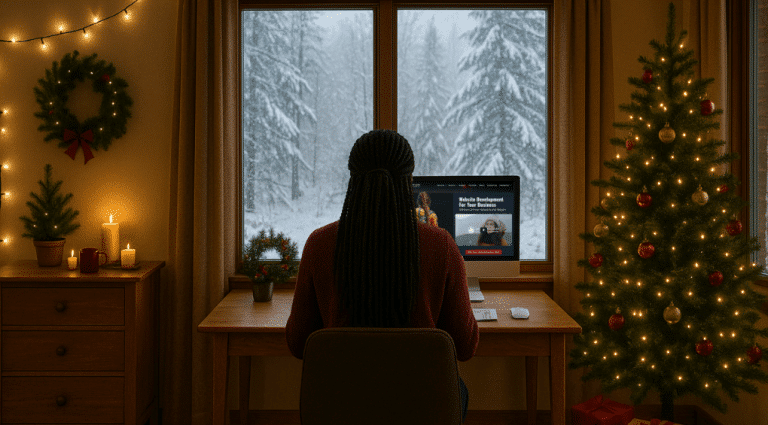
If you would like to see Kylee’s magic design touch in action, contact JamboJon today for a free consultation on how we can transform your website!
I Could Use Some Professional Design Advice


")


")
