How Do You Create a Gantt Chart?
April 8, 2024

You’ve planned your project with intricate detail. You’ve accounted for budget, materials, and helpers along the way. But sometimes, an unanticipated storm knocks your project off track. When your best-laid plans get smudged beyond recognition, even the simplest tools can help you recalibrate. Start with a brand-new timeline. A gantt chart illustrates a realistic project schedule. You can visualize the start dates, the finish dates, and the domino-effect for each element of the project. How do you create a gantt chart in Google Sheets? It’s simple, really.
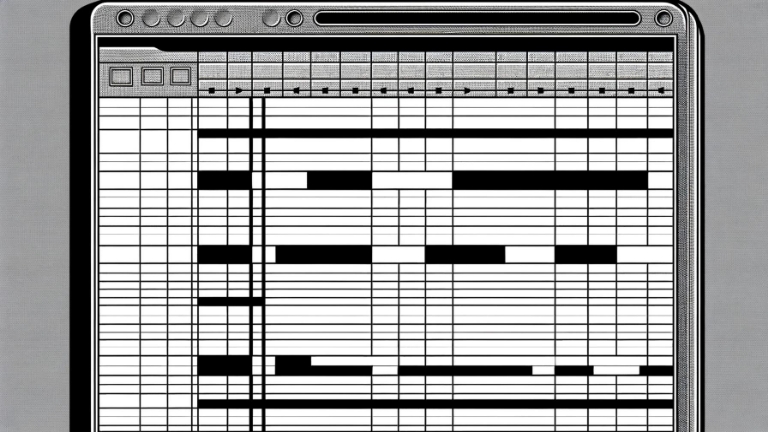
To construct a gantt chart in Google Sheets, start by organizing your spreadsheet with columns for task names, start dates, durations, and end dates. List all project tasks in the task name column, along with their respective start dates and durations. Use formulas to calculate the end dates based on the start dates and durations. Once your data is entered, select the range containing your task information and insert a bar chart. Customize the chart to display the task bars horizontally, representing the project timeline. Apply conditional formatting to the chart to color-code tasks based on status or highlight overdue tasks. As you progress through the project, update the spreadsheet with any changes to task durations or start dates to adjust the gantt chart automatically. This method allows you to track project progress and manage timelines in Google Sheets visually. The simpler the tools, the more effective the outcome.
It’s one thing to circle your deadline on a wall calendar, it’s quite another to have a color-coded visual chart projecting your progress from every angle, every step of the way. You might be tempted to pull out a white board and dry erase marker for your company meetings. A gantt chart is just as easy, and it tracks it all.


