Steering Her Own Course:
Kenbry’s Website Shift
Kenbry’s Website Case Study
Setting Out Solo
As an entrepreneur, you might start your business borrowing tools and templates you inherited from someone else. The painted walls in your store clash with your logo colors, or your website works well enough, but puts users to sleep. Neither reflects the voice, purpose, or the vision of your brand. It’s like rowing in someone else’s canoe. You’re moving forward, but not necessarily at the pace, or direction you want to go. You’re stuck following someone else’s rhythm and route.
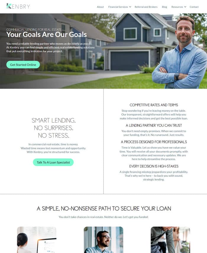
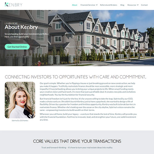
That’s where Sybrina Kenbry found herself. Her functional website had serviced her lending company for a time, but no longer reflected the tone or customer experience she wanted for her current brokerage. The flat, generic content lacked emotion. No strategy on her site left users confused where to find information. Kenbry refused to continue rowing with someone else’s crew. Like any solitary paddler easing into new waters, Kenbry needed more than just a sleek canoe, she needed a navigator. JamboJon became that co-navigator. To set out solo, she needed to find her own voice. It required her to make strategic decisions and finally take control of the oars.
Finding The Path
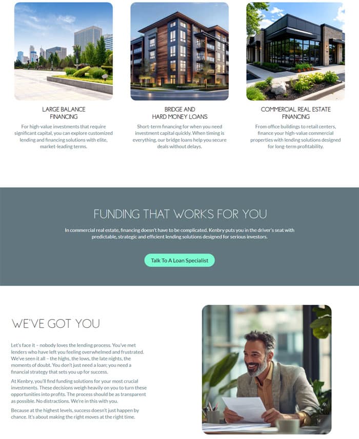
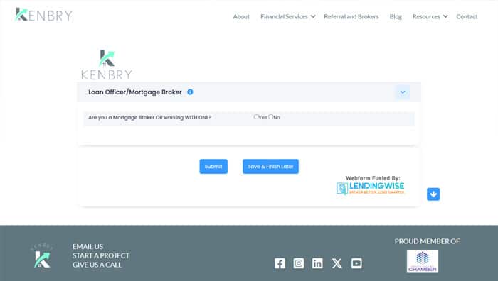
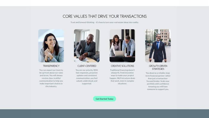
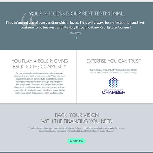
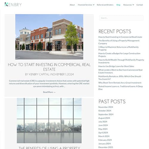
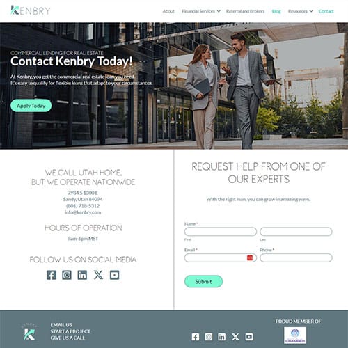
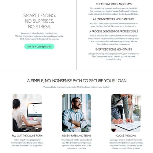
JamboJon gave Kenbry a streamlined route. Given plenty of options, she chose the look, the voice, and the elements that best fit her brand. From selecting image sets to balancing design aesthetics, we empowered her to steer her own canoe. With a CRM-specific form that couldn’t be styled to match the new site, we created a standalone landing page for it, preserving both the look and function. When imported pages didn’t translate directly, we reconfigured them to suit the new layout, giving her content a new home without rewriting everything. In key places, we rewrote the existing content with a refreshing, familiar voice. Once Kenbry removed the waterlogged baggage from the past, she steered herself towards a site that’s beautiful, clean, and ready for her next adventure.
- Created a standalone page for a CRM-specific form to preserve the aesthetics.
- Reconfigured old web pages to suit the new layout and design.
- Rewrote content with a fresh, relatable voice.

