Blake Family Medicine Website Case Study
Dive a Little Deeper
Take a Completely Different Angle
It is difficult to build a business that offers products or services that are not only useful, but meaningful. As an entrepreneur, you know that. You solve real world problems. Sometimes, even when you offer valuable solutions, your potential clients miss out on them. They can’t see what is right in front of them. It’s like they stand hesitantly on the water’s edge, afraid to get wet. How do you convince them to do more than dip their toe in the water? How do you communicate your deeper purpose, better methods, or unbelievable outcomes? It takes the right approach to help clients really dive in and see potential solutions in a different light.
That’s exactly what Dr. Blake set out to do with Blake Family Medicine, one of the first Direct Primary Care (DPC) Clinics in Utah. In this region of the United States, large healthcare companies monopolize the industry. Here, insurance companies determine how you handle your health concerns. Dr. Blake turns the traditional approach to healthcare on its head. His website needed to match the heart of his mission: give patients a radically personal, direct, and caring experience with their doctor by cutting insurance out of the equation. He refused to stand behind a typical, sterile medical website. He wanted a site that would help people understand what they were missing. Like finally putting on that snorkel mask and experiencing a whole new world of healthcare.
A Clearer View Beneath the Surface
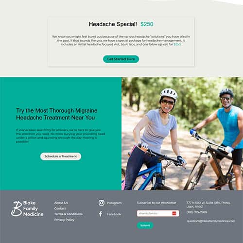
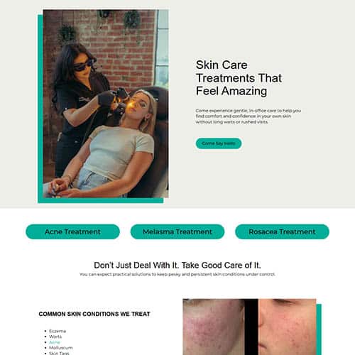
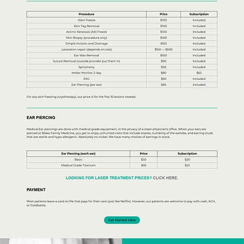
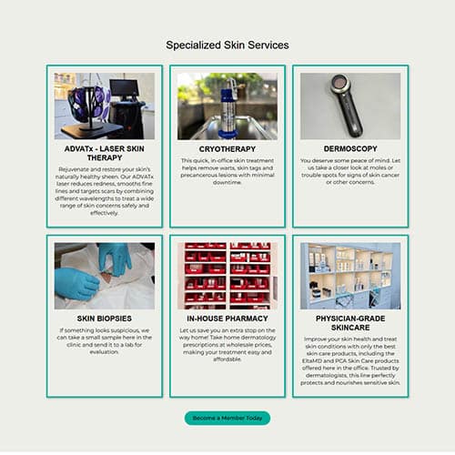
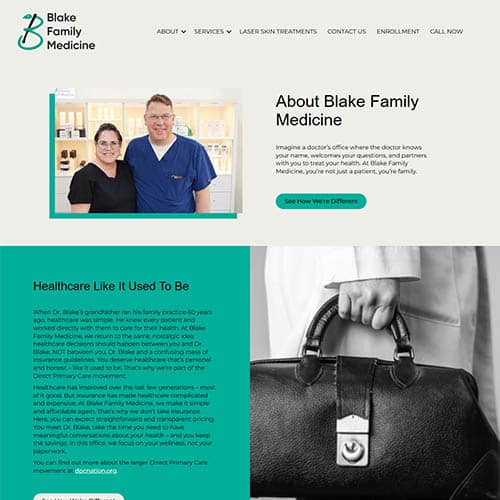
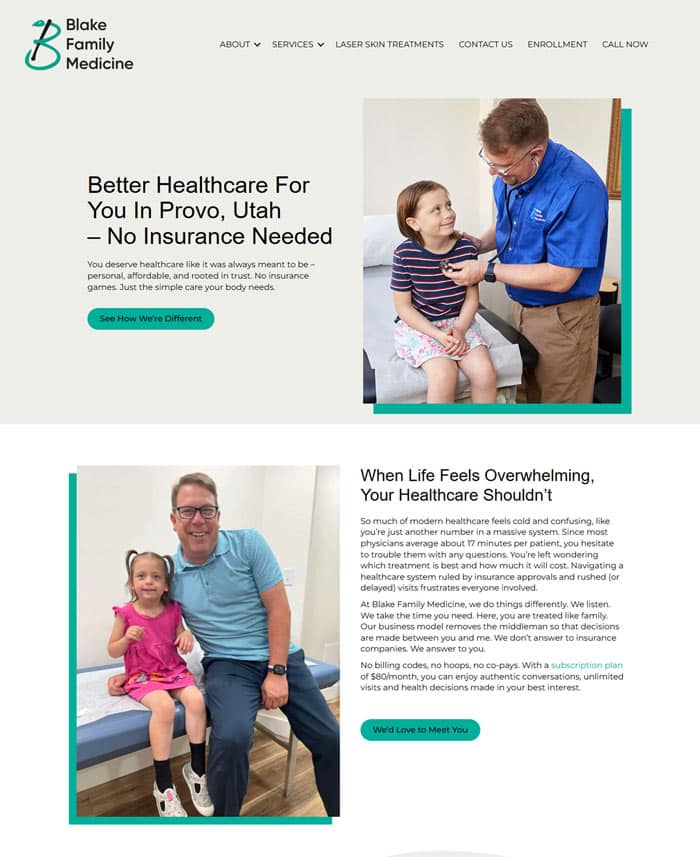
You don’t need to build an underwater empire to give people a breathtaking view. When Blake Family Medicine came to us, we wanted to help patients see the deeper beauty of direct primary care. To do that, we overhauled the content to reflect the real voice of the practice – warm, personal and compassionate. Not clinical or robotic. We reorganized the site architecture to make it easier for users to navigate, understand services, and feel welcomed, whether on a desktop or mobile. Personal pictures replace stock photography to better reflect the practice. Since the site needed to say, “Here’s a doctor who cares,” every click feels more like a conversation than a cold intake form. All design elements serve as useful and intuitive resources for each patient. It opens eyes to the beauty of what you may be missing out on.
- Changed the content to reflect a warm and compassionate voice.
- Reorganized the site structure so that it is easier to navigate.
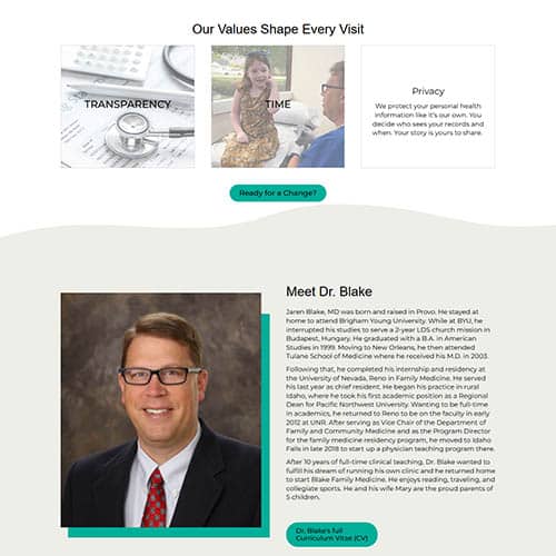
- Replaced stock photography with personal pictures.
- Added useful, intuitive design elements.
Key Features

Authentic Photography
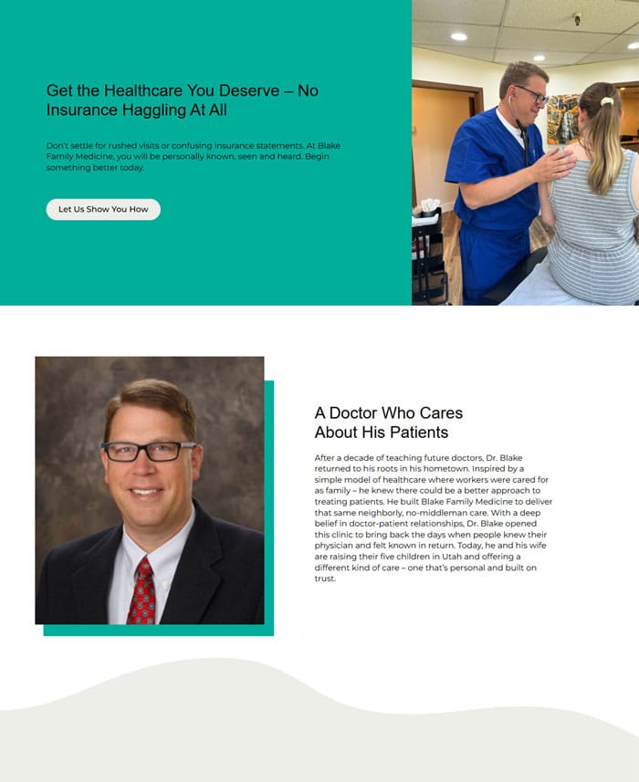
Browse through actual photos of Dr. Blake with his patients. No stock imagery here. With this personal touch, you instantly get a sense of who Dr. Blake is: approachable, present, and trustworthy.
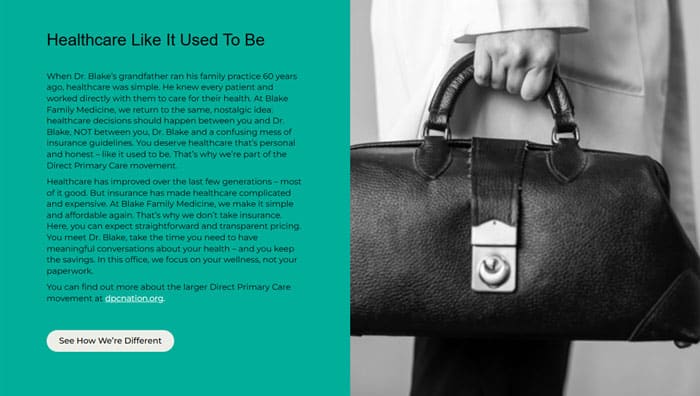
Simple, Nostalgic Design
Inspired by the old-school Norman Rockwell view of the doctor-patient relationship, we kept the design minimal and messaging simple. Its clean and calming tones invite you to slow down and take a deep breath.
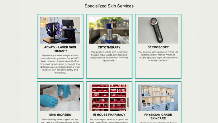
Intuitive Structure
The site flows naturally, helping you, as a first-time visitor, find answers. The structure introduces more about DPC and Dr. Blake’s services. You get full access to a compassionate doctor who listens to you – without having to answer to an insurance company.

